Some American economic historians suggest that a tariff rate of forty percent would have reduced "the real incomes of southern slaveholders by at least 20 percent." The following chart appears in a popular textbook on American economic history.
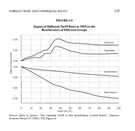
The graph shows that from the very first, as the tariff rate increases, the real income of the northern laborers and capitalists goes up while that of the landowners and slaveowners goes down. This shows a substantial inequality between North and South that grows larger with the increasing tariff rate. Although this is the basic engine of sectional enmity, this wide gap gets little attention.
The information shown in the graph is generated from an economic model based on data from the year 1859. The graph's author frankly cautions that the results are sensitive to the assumptions made in constructing the model of the economy.
The graph purports to show "real incomes," that is, the nominal incomes adjusted for the general price level. To compare prices in different years, economists customarily adjust prices by the general price level of the time. In this way, dollar amounts in different periods can be compared on the basis of their purchasing power. Economics students learn this principle very early and to professional economists it is second nature.
There is very good reason for the adjustment. When a government prints more dollars, inflation lowers the value of each dollar. The nominal value becomes disconnected from the "real" value, making comparisons among different periods difficult.
With respect to the tariff rate, however, there is a difficulty with the automatic application of this adjustment. The general price level itself is seriously affected by the tariff rate. Increases in the tariff rate slow the economy, inhibit the circulation of money and drag the general price level down. Adjustments made with that shrinking yardstick largely obscure the actual steep decreases in the price of cotton and tobacco.
Rather than relying on a speculative economic model, it is important to look at what actually happened to the general price level after the Republicans got control of the tariff rate . The following chart shows the relationship between the tariff rate and the general price level for the fifty-year period from 1871 to 1920. Notice how steeply down the tariff drags the general price level.
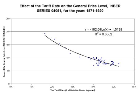
The tariff rate appears to account for 88% of the variation in the general price level. The probability that this pattern could occur by random chance is very low. That probability (called the "p-value" or "significance f") is 6.68 x 10⁻²⁴, or
0.000 000 000 000 000 000 000 00668
It is a very, very small probability. We can be highly confident that there is something significant going on here.
The Federal Reserve Bank in New York City prepared the index of the general price level that makes up the National Bureau of Economic Research (NBER) price series 04051 shown in the graph above. Following is a table that identifies the various prices that comprise the index along with the weight they are given in constructing the composite.
| Index Component | Weight |
| Industrial prices, non-agricultural, wholesale | 10% |
| Farm prices at the farm | 10% |
| Retail food prices in 51 cities | 10% |
| Rents in 32 cities | 5% |
| Clothing, fuel, furnishings, etc., retail | 10% |
| Freight and transportation costs | 5% |
| Realty value, urban and farm, | 10% |
| Securities, bonds, and stocks | 10% |
| Equipment and machinery | 10% |
| Hardware prices | 3% |
| Automobile prices | 2% |
| Wages, Federal Reserve Board, New York composite | 15% |
| Total | 100% |
This price level series is a broad representation of American economic activity. The tariff rate drives the whole economy steeply down by restricting the imports that are the source of exchange for our exports. Prices decline because the people have less money to spend for goods and services. The graph above demonstrates that the tariff is a pernicious economic poison on a national scale, a very bad medicine.
The following chart shows the historical levels of the price level and tariff rate over the period 1871-1945.
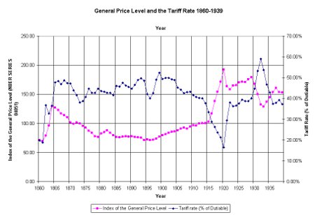
As a general rule, the price level seems to go in the opposite direction from the tariff rate. When the tariff rate goes up, the price level goes down. When the tariff rate goes down, the general price level goes up.
In the years after 1920, however, the general price level seems to be shifted upwards from the position the tariff rate had dictated in the past. The following chart has a second regression line added for the data after 1920.
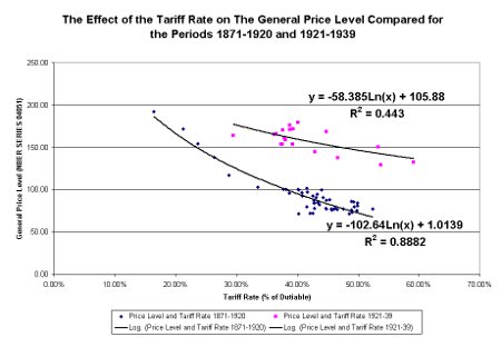
Because the price-level curve for the years after 1920 floats above the one for the previous fifty years, it appears that something has caused the price level to increase above where the tariff rate would normally dictate it should be. We might speculate that this was due to an increase in the money supply by the Federal Reserve, desperately trying to drive the price level up in an effort to ameliorate the depression in farm commodity prices. Milton Friedman and Anna Schwartz referred to the decade of the 1920s as the "high tide of the Federal Reserve." The expression seems particularly appropriate.
A reduction in the tariff rate, the only real solution to the problem of depressed farm prices, was not politically feasible in the 1920s. Many Congressional Democrats joined the Republicans in 1929 and 1930 in voting for a rise in the tariff rate. "Protection" was touted as a panacea for America's problems and, despite the warnings of economists, the higher tariff became law because of its political popularity. Free trade advocates such as Democrat Cordell Hull, were a small, frustrated minority.
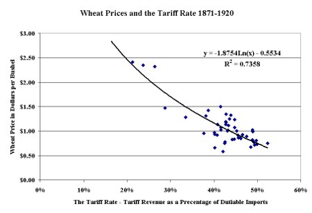
The difficulty of adjusting cotton prices by the general price level is illustrated by the decline in wheat prices with the tariff rate.
[More to come.]